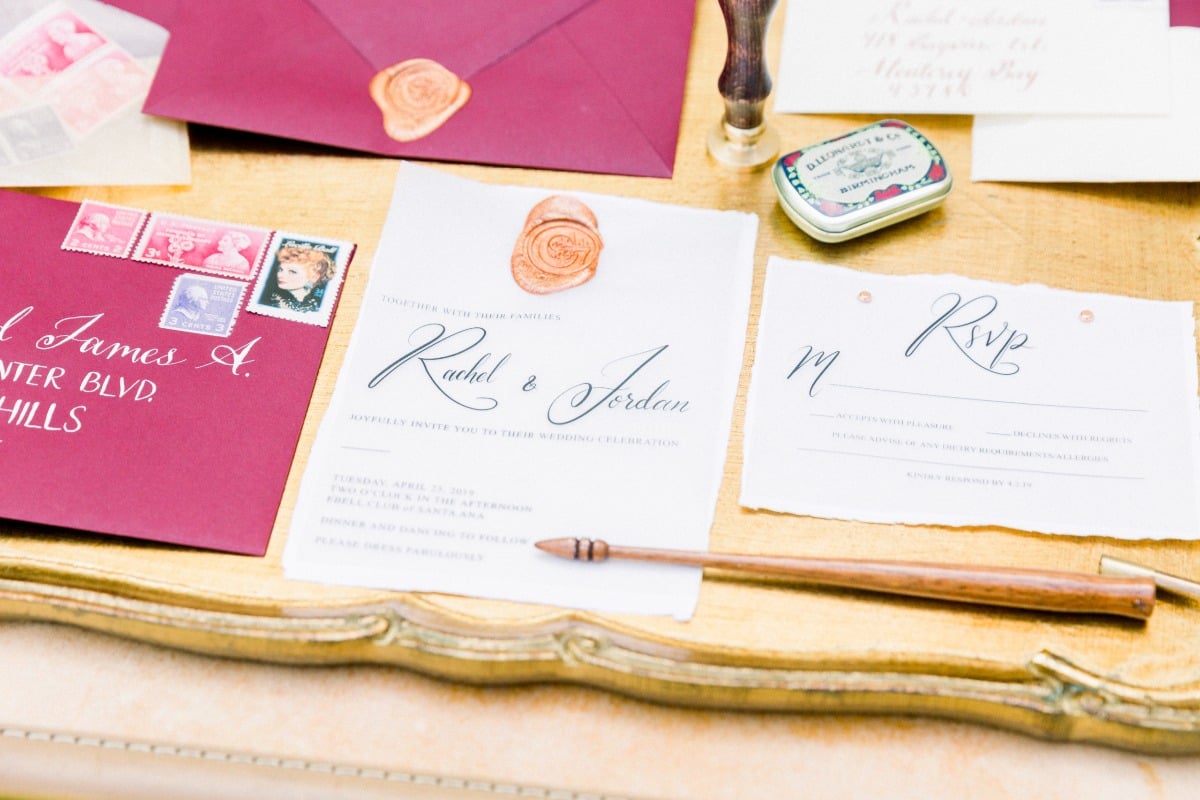
A Rich Jewel Toned Invitation Suite for Your Fall Wedding
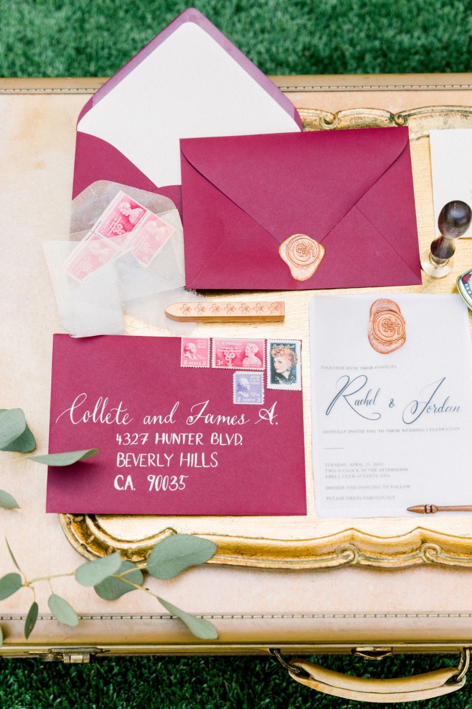
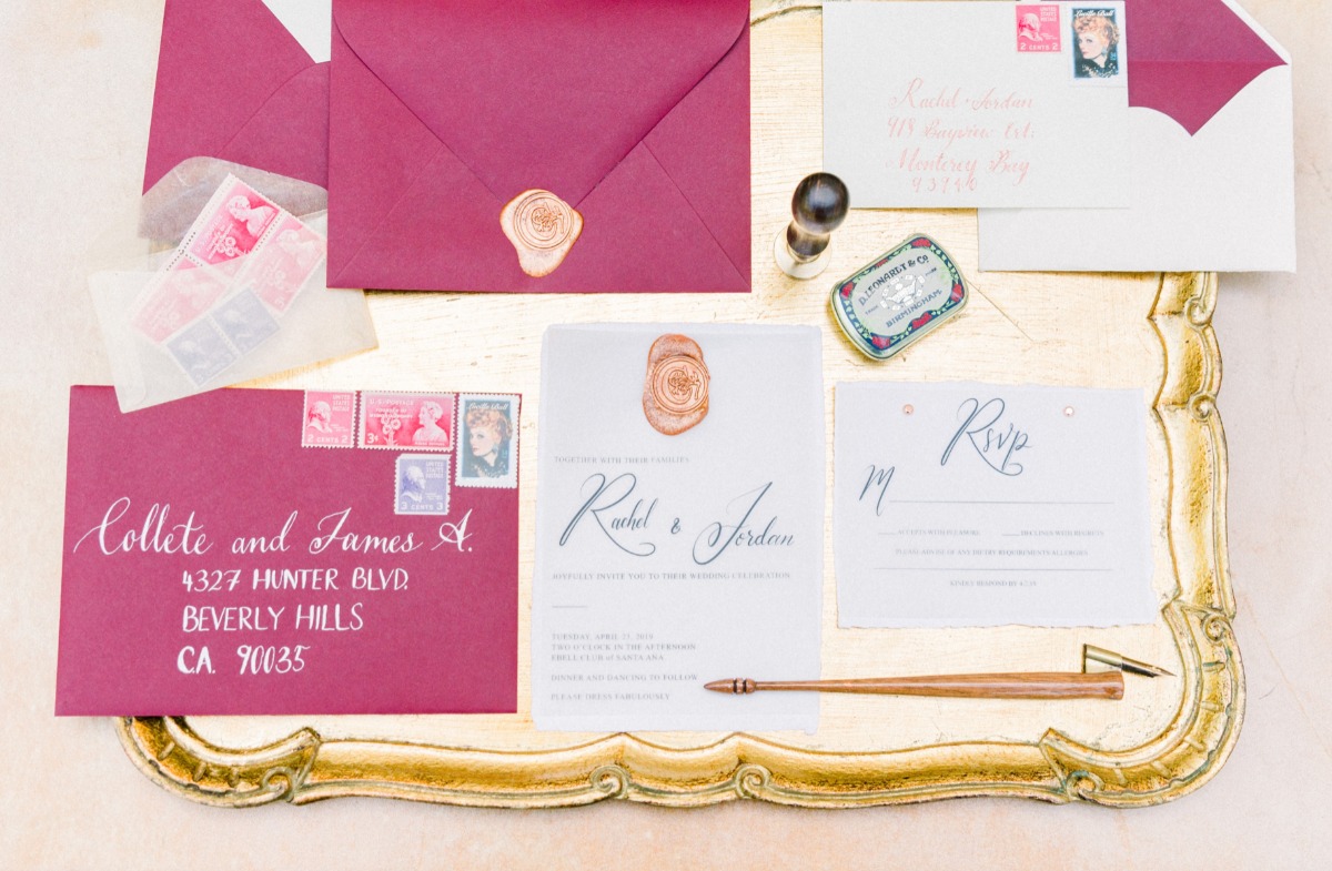
Naomi from Bowties & Bouquets shares a rich jewel toned invitation suite for your wedding. For this Color Rich Wedding, the theme and inspiration was the 1950's with timeless vintage romance. We were inspired by the Emmy winning comedy TV series The Marvelous Mrs. Maisel for our overall design approach. We wanted a bold color for the design of the invitations to match with the bold theme of the 50's as well as to pair perfectly with Fall tones.
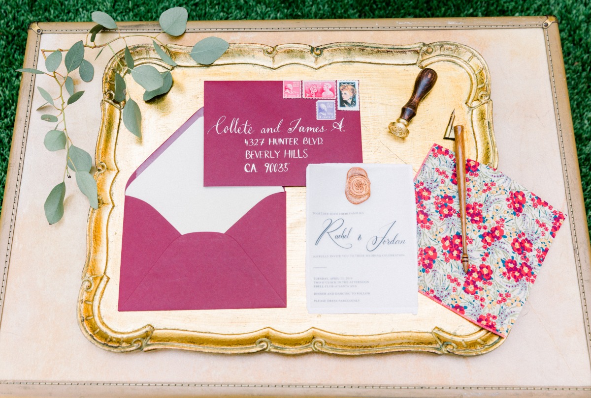
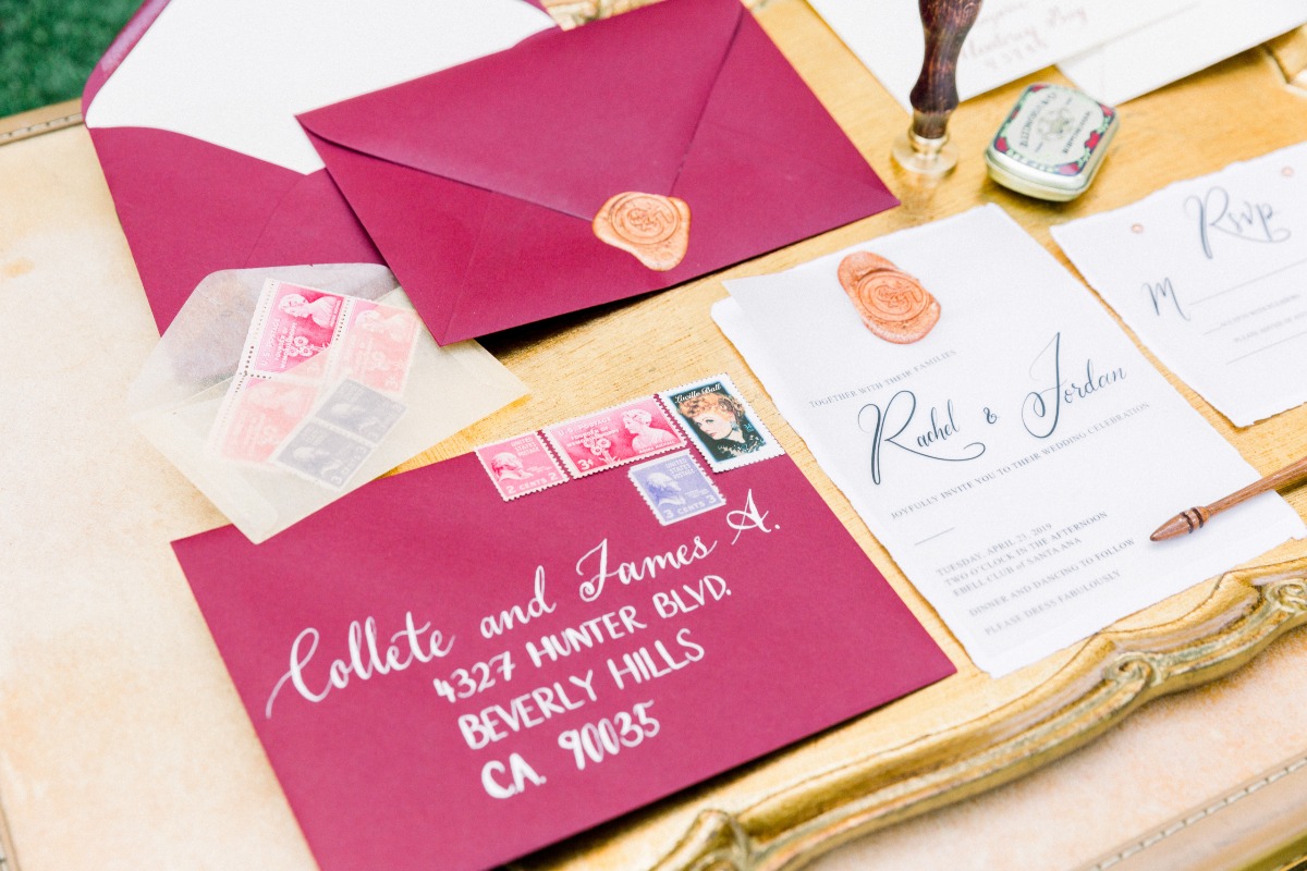
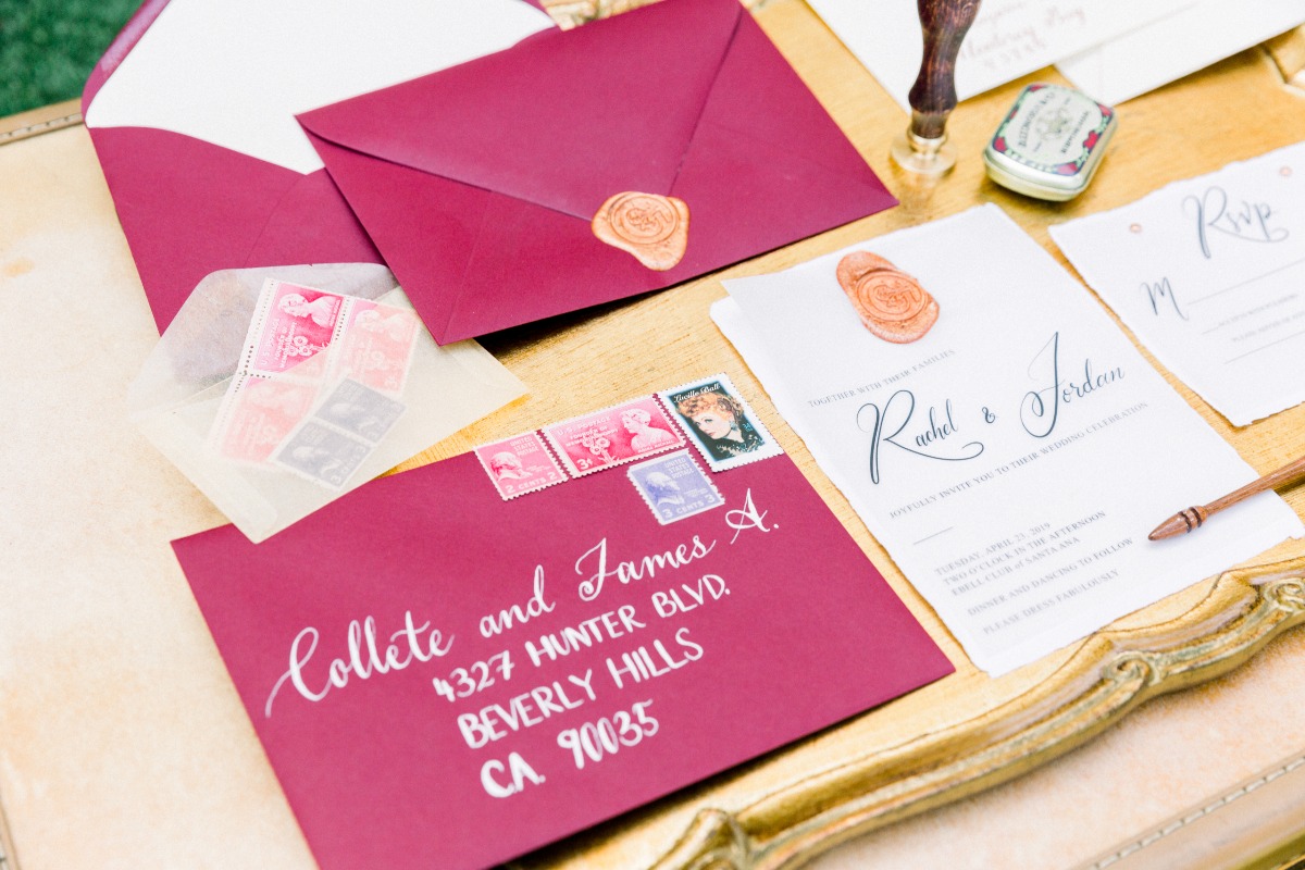
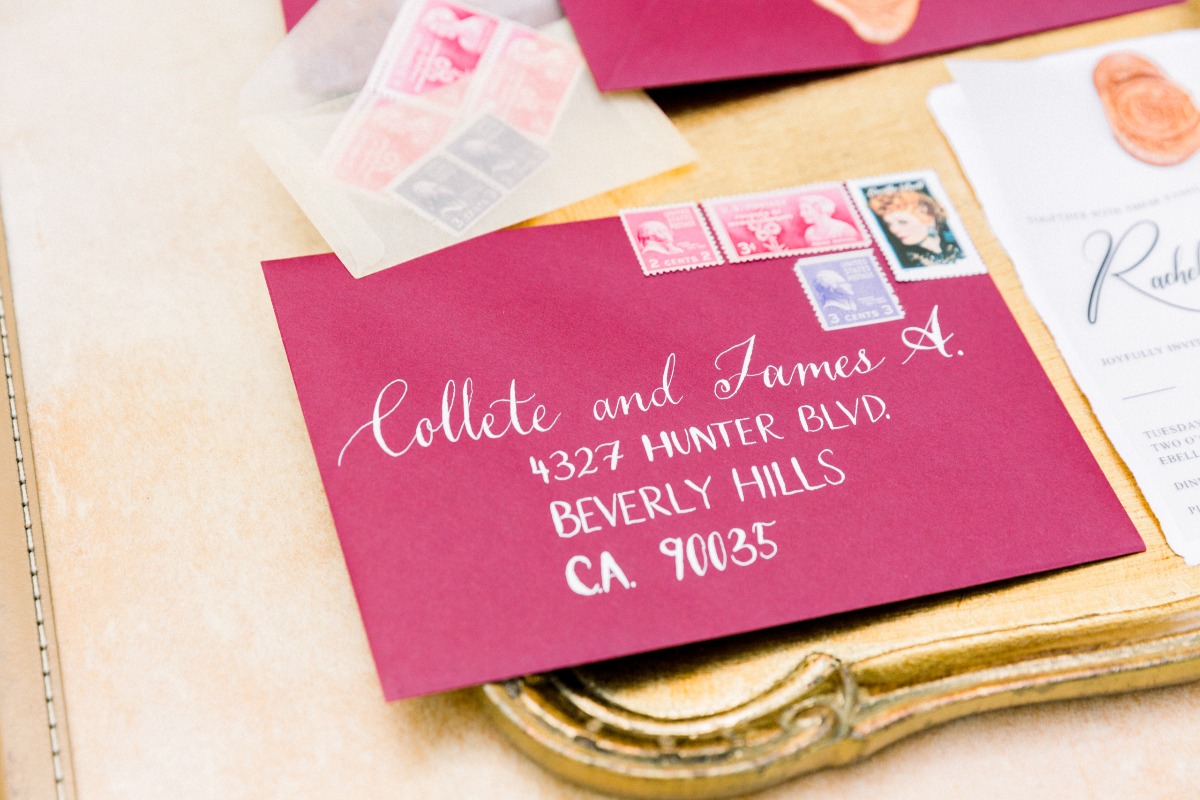
The rich hued burgundy invitation envelope, when paired with a vellum invitation and a wax seal created this stunning and beautiful vintage feel that we wanted to get across. The 50's so often sweeps us away with the romance and wonder so this invitation suite needed to feel romantic. We achieved that by playing with vellum and having a wax seal emblem right on the invitation itself.
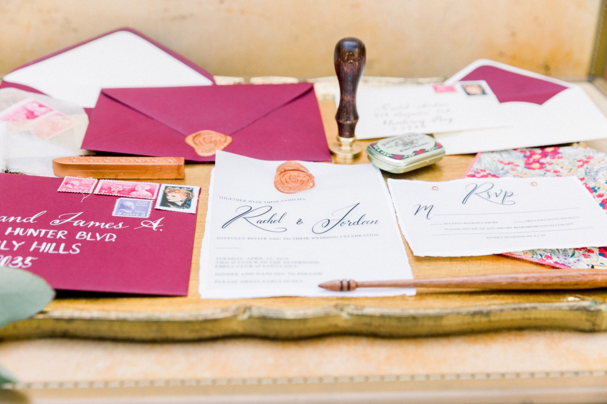
Because of the Fall Wedding Season, we wanted the colors to be kept to gold, copper, black and burgundy. These colors combined were a bold pop and provided a statement when guests opened their invitations, setting the tone of what was to come for the Couple's future Wedding Day.
We believe that invitations set the guest's first expectation, it suggests the overall tone of the wedding day -- casual or formal, luxurious or simple, etc. Your guests first impression of your Wedding Day will be with your Invitation Suite, so consider choosing a design that matches the overall feel of your Wedding Day.

Think about what colors speak to you and your fiance. Decide on what level of formality you want to achieve. Consider what season you are in and how to incorporate those tones into your overall wedding design as well as invitation design. This bold statement design spoke to the theme and season of this wedding and I loved planning this incredible day! From hand picking the elements of the invitation suite to choosing the colors, I loved all of it!!
View All Images- Event Planning & Design: Bowties & Bouquets
- Paper Goods & Calligraphy: Honest Type
- Photographers: Manya Photography
- Rentals: Provenance Rentals
- Venues: Ebell Club of Santa Ana
