Custom Wedding Invitations Set the Tone for your Perfect Day
First came the heart-melting proposal. And then the record-breaking number of likes on your engagement posts on social media. It all seems surreal—it’s a truly magical time.
For your guests your ultimate day to remember starts with a save the date card and invitation suite—creating the perfect tone and setting expectations soaring. Your wedding stationery encompasses the mood and theme of your day—assuming you’re working with an experienced stationery designer who is in tune with your vision. We asked Lynn Jacques of The Bridal Press how she sets the mood with paper goods:
“Creating and conveying a specific charm and feel for a wedding through paper is something that only design and detail will bring. In addition to being a graphic designer for the better part of my life I’ve explored and studied visuals and how they evoke emotion. I have a good sense of how to speak through art, design and the layering of detail.
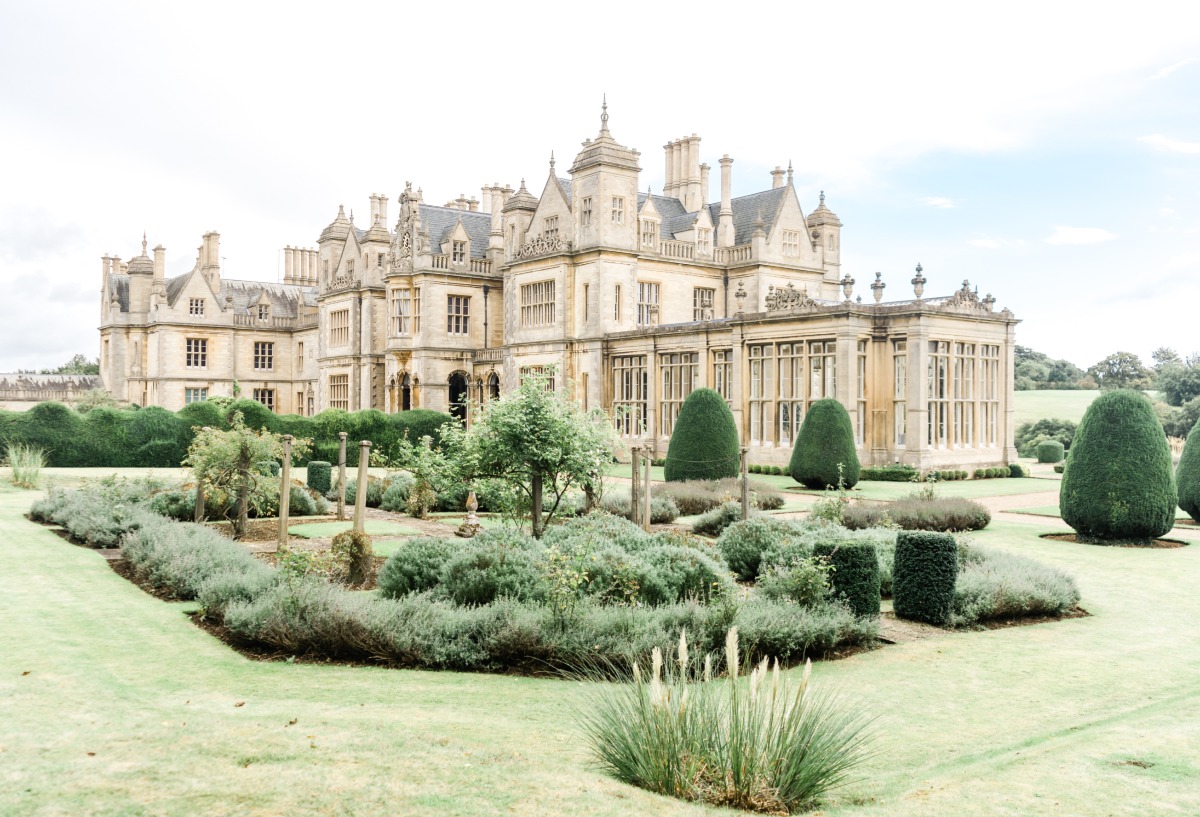
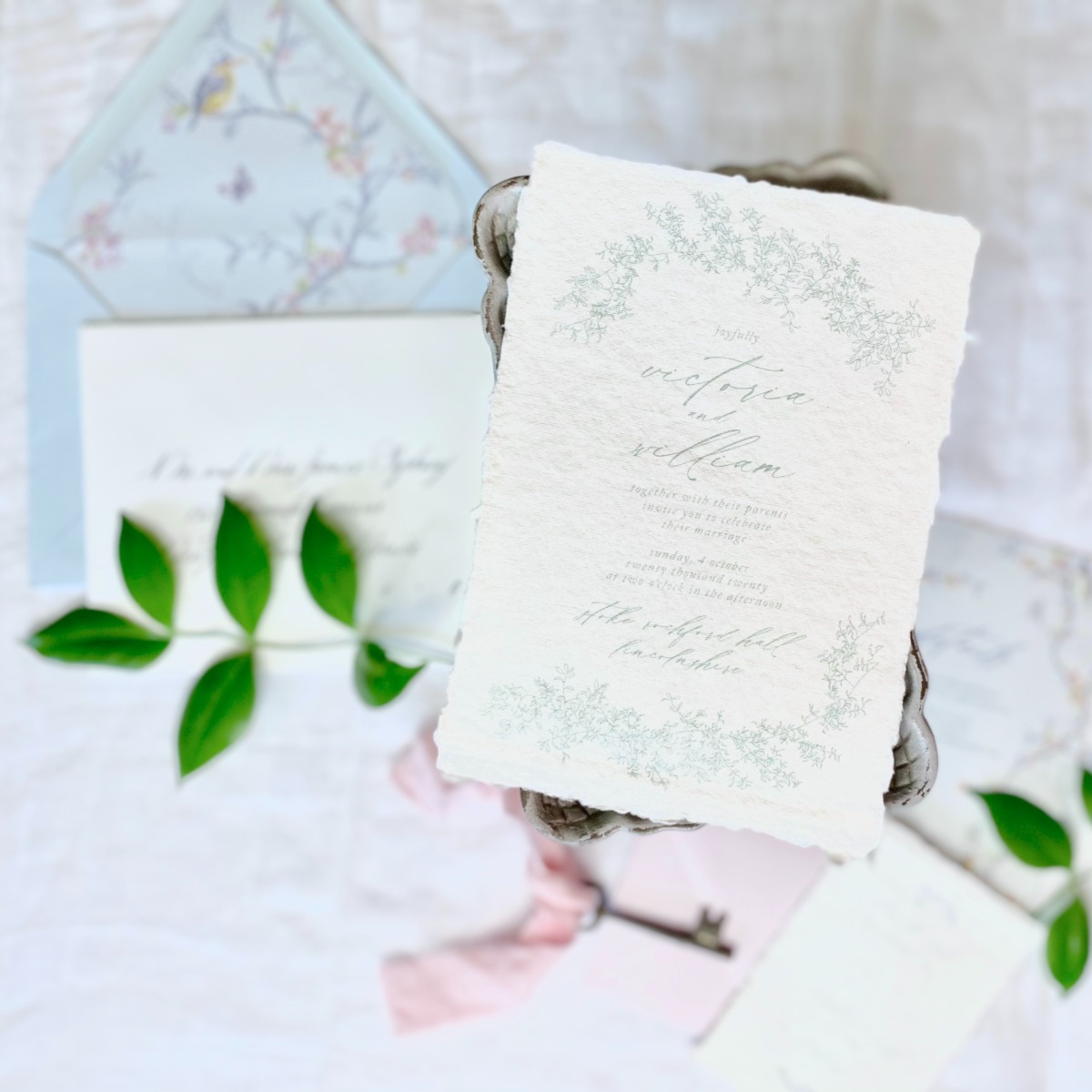
It’s the visual and tactile elements that create the mood. For example, working on a suite for an editorial at Stokes Rochford Hall—a dreamy fairytale venue in the UK—the planner wanted a princess-marries-her-prince-charming vibe. For me—and I’m guessing for most—fairytales always have a distinctly vintage flair. Drawing on that I went with a very textured handmade paper with a deckle edge. Handmade paper definitely says vintage artisan.
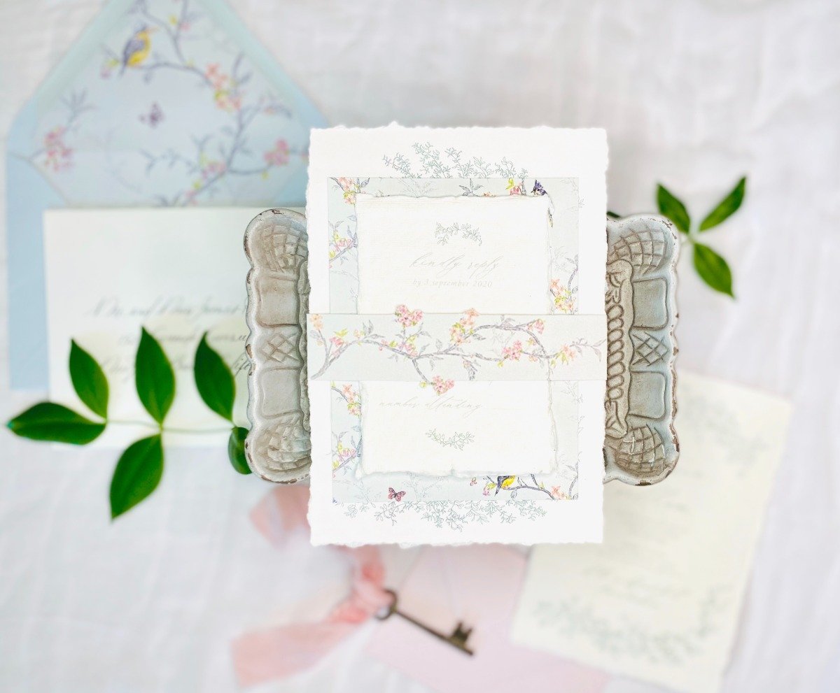

For the graphic detail I drew on memories of an old Hans Christian Anderson book my mom used to read to me when I was a child. The pages were bordered with beautiful blossoming branches and vines with tiny birds and butterflies—what I still envision when I think of a fairytale. Using a warm gray blue background to stay with the old world feel, and a die cut band to highlight the lovely blossoms, our suite was born—fit for a princess marrying her prince.
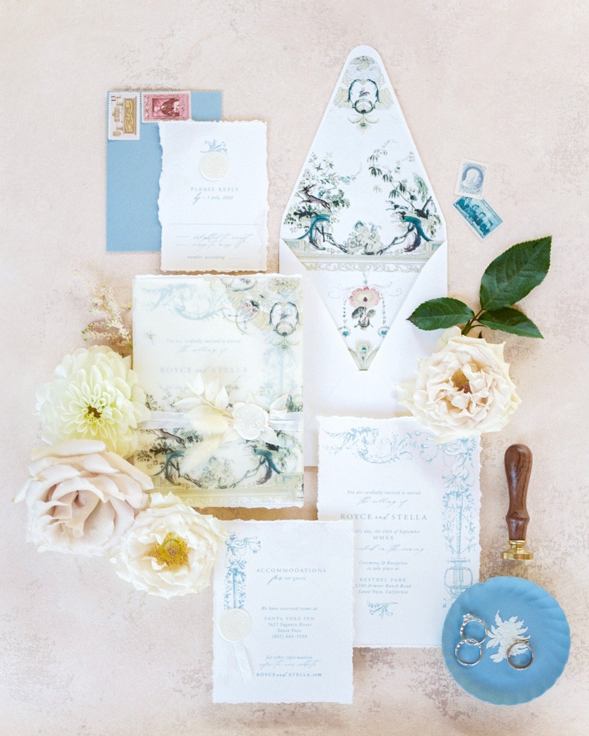
There was another suite this year that I haven’t been able to stop looking at—for a gorgeous trans couple. With the backdrop of Kestrel Park in Santa Ynez, California—the closest thing to a French countryside dream we’ve got here, it was truly stunning.
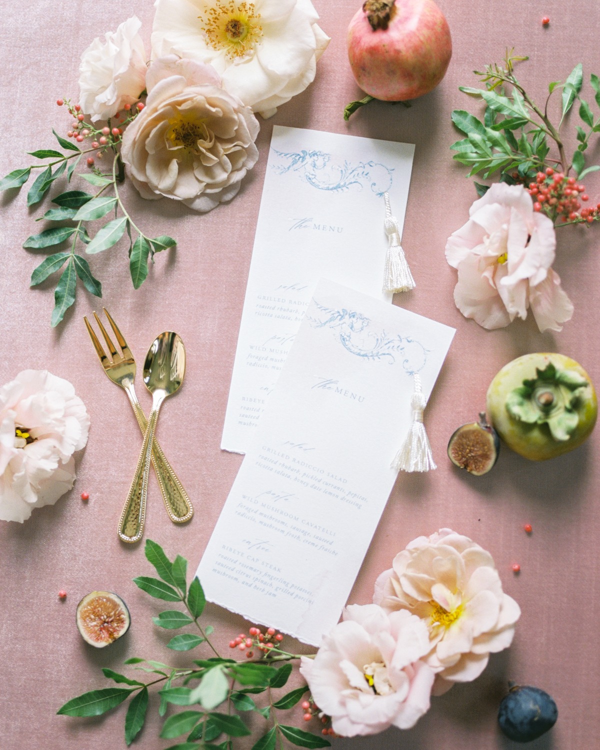
The planner had an amazing vision—one of soft opulence. Envisioning an early 19th century French flair, I chose a beautiful vintage Chinoiserie artwork as the focal point. With a nod to the rich fine arts of the era I finished each piece with hand-painted highlights, silk ribbon, tassels and wax seals that gave them the depth of opulent French fine art.
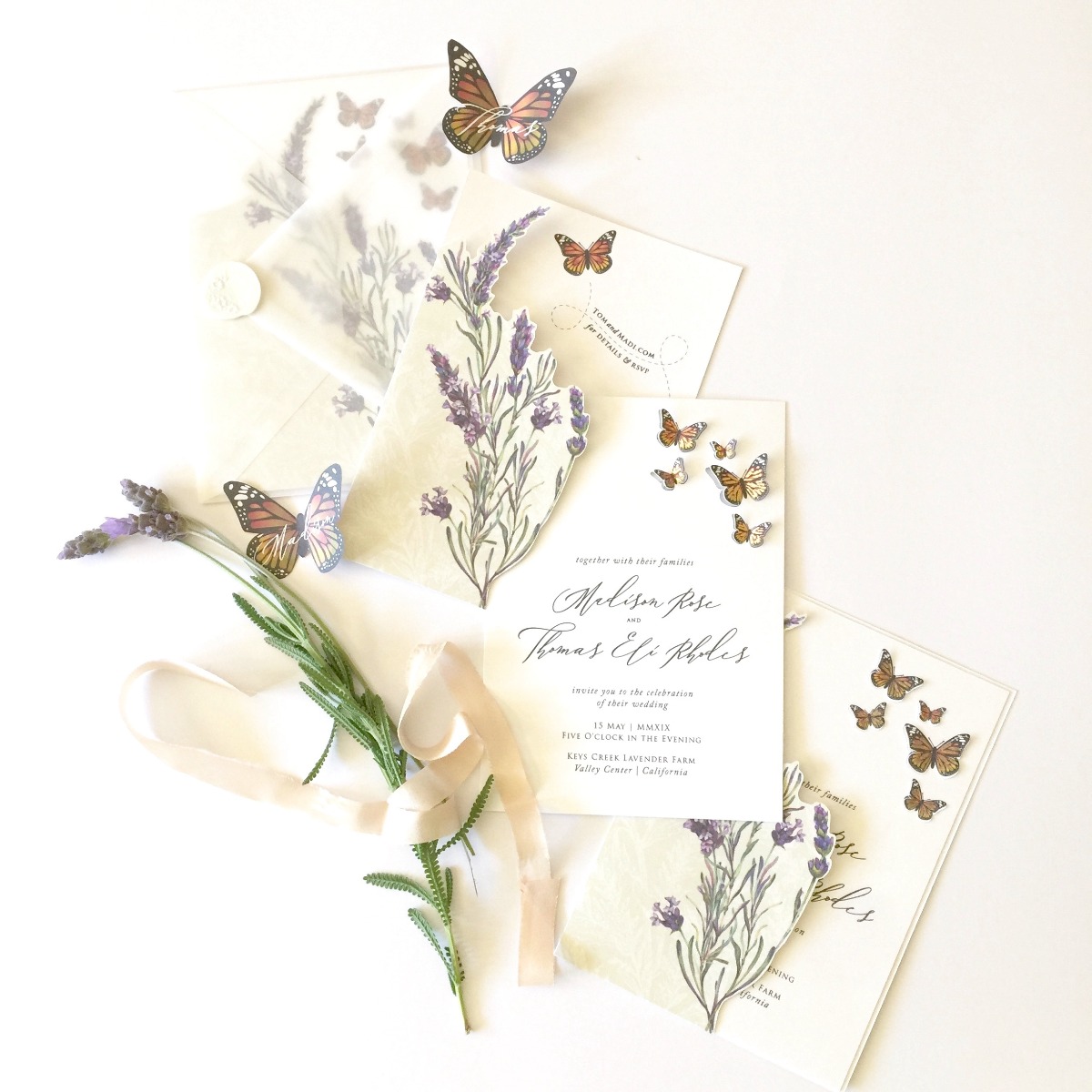
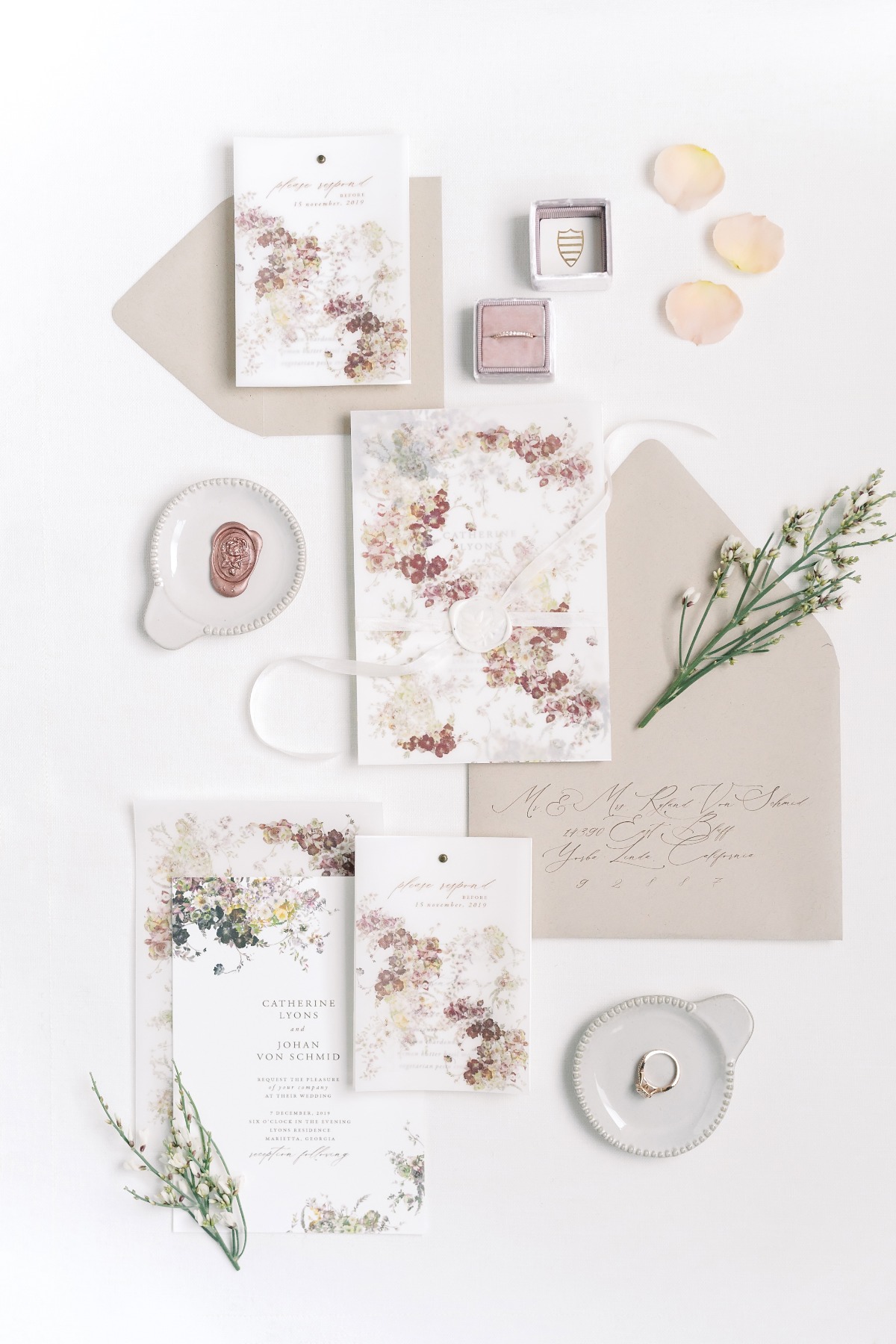
But it doesn’t all have to be over the top. A bit more simplified design can also bring a theme to life—a suite for a butterfly grove wedding, covered with die cut Monarchs that slips into a lavender jacket. Or, for a charming Atlanta suburb, a fall wedding with a vintage flair—a suite covered in fall florals and letterpress typography provide a traditional charm.
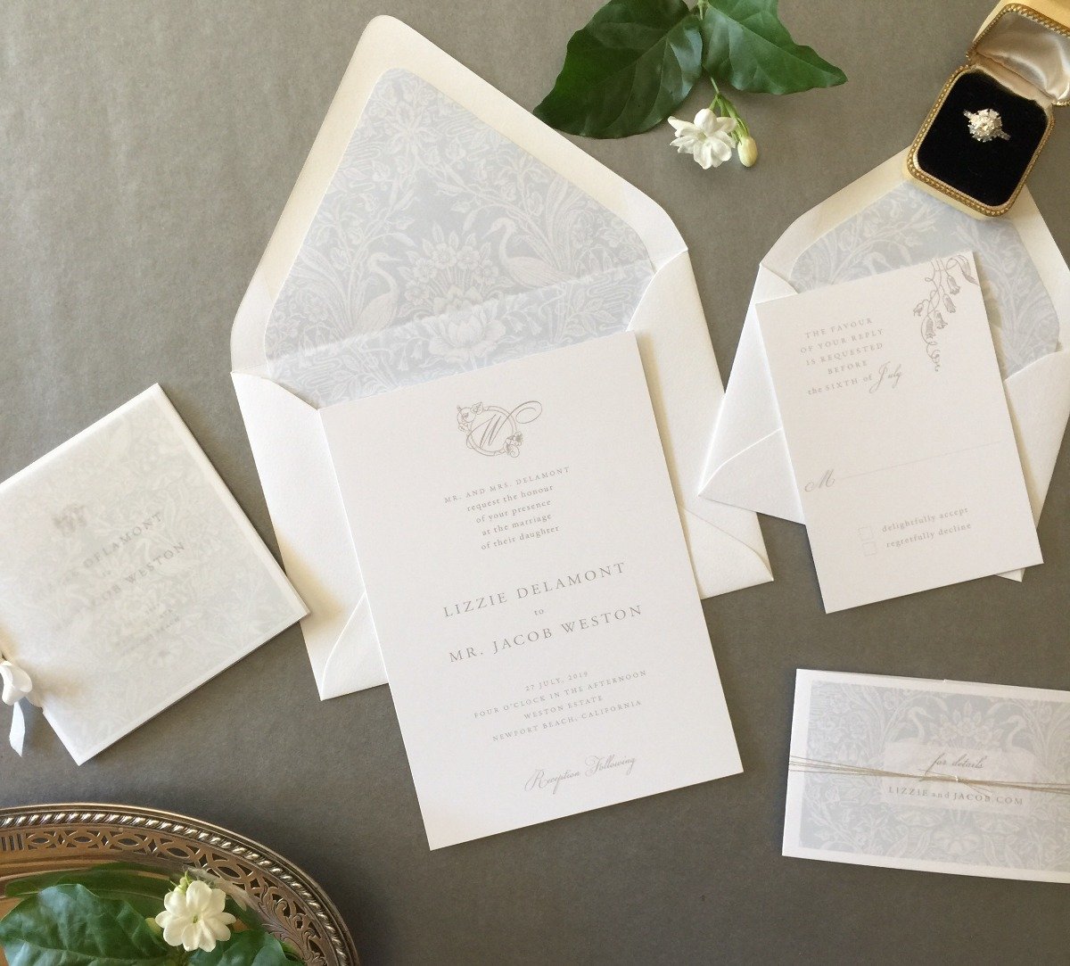
A very classic custom crest and typography in soft gray can also be simple perfection for a lovely outdoor monochrome white wedding. I love to immerse myself in a couple’s vision of their dream wedding day and create a piece of heirloom art that will be the prelude to their wedding day—one they’ll cherish for years to come.
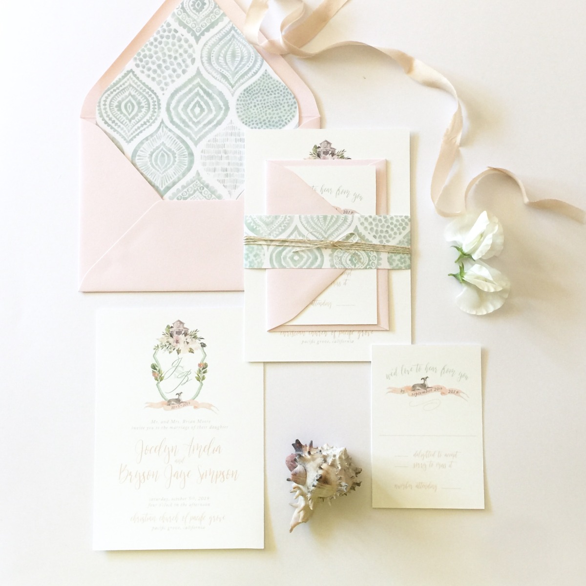
Whether the it’s the deckle edge of the paper, the tactile letterpress impression, the detail of an illustration, the rustic texture of an exotic wildflower seeded paper or the notable quality of a fine silk ribbon, it’s the detail that sets your wedding stationery apart, and tells your guests that they’re in for a truly memorable experience.”
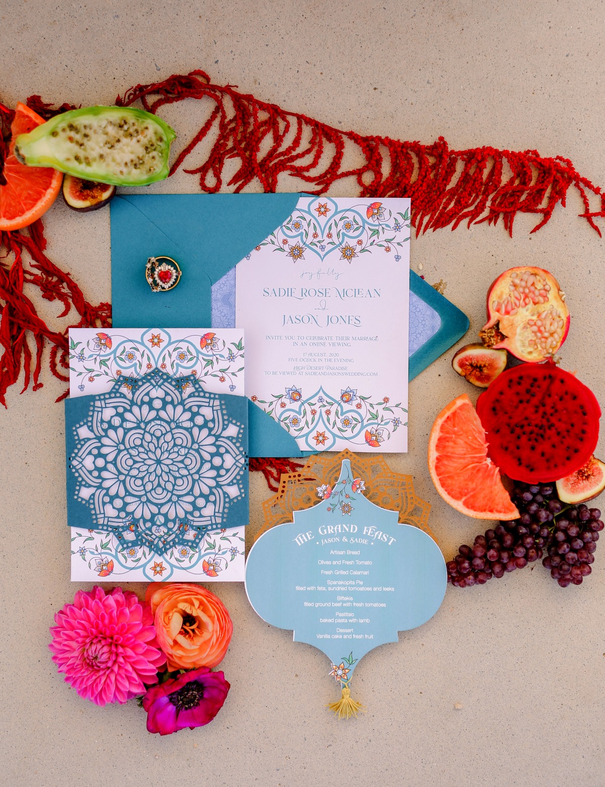
- Event Planning & Design: Radleigh + Sage (planners for Kestral Park wedding)
- Paper Goods & Calligraphy: The Bridal Press
- Photographers: Fawcett Photography
- Photographers: Madeleine Collins Photography
- Photographers: Vanessa Rose Photography
- Photographers: Playful Soul Photography

