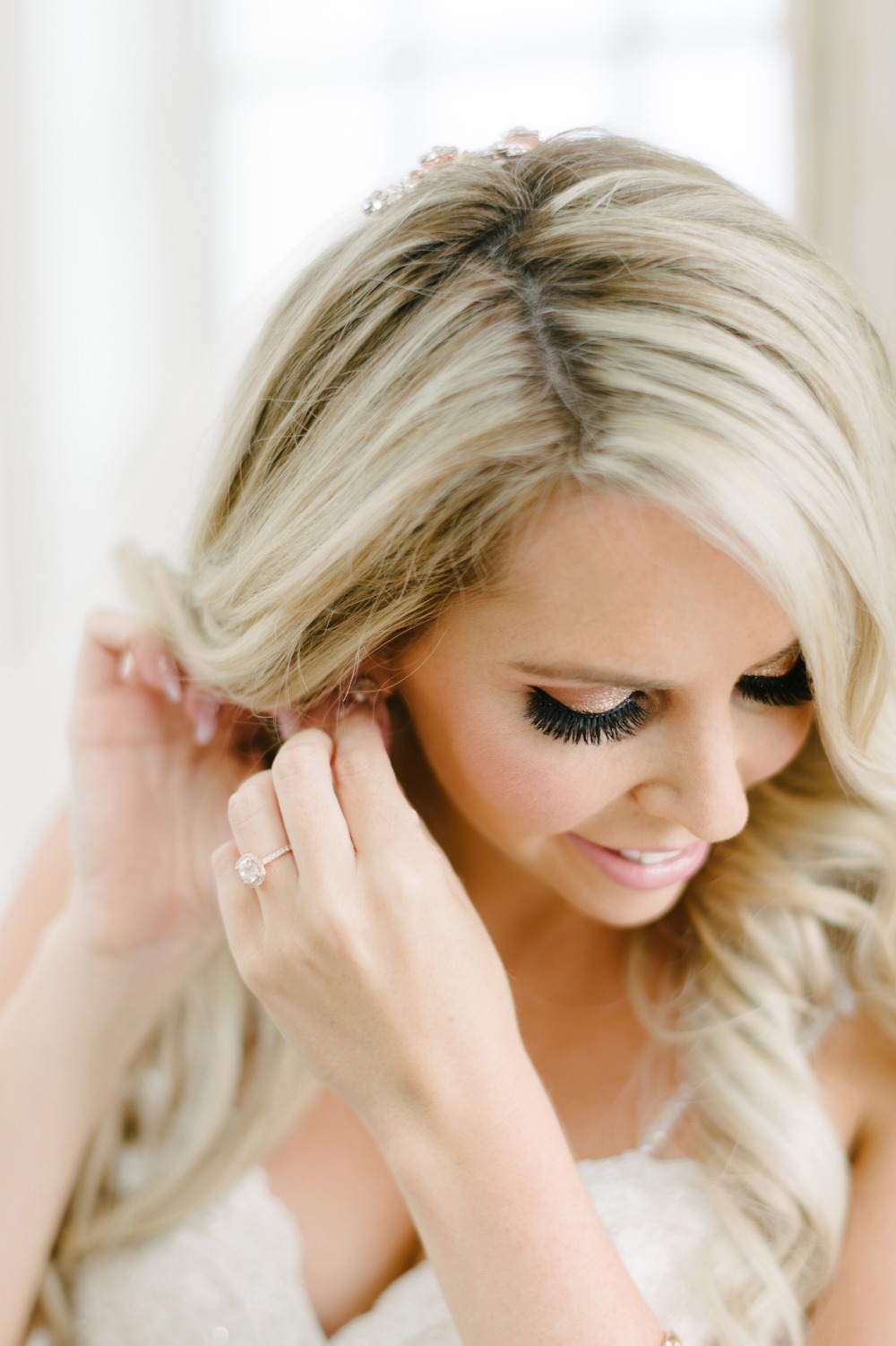
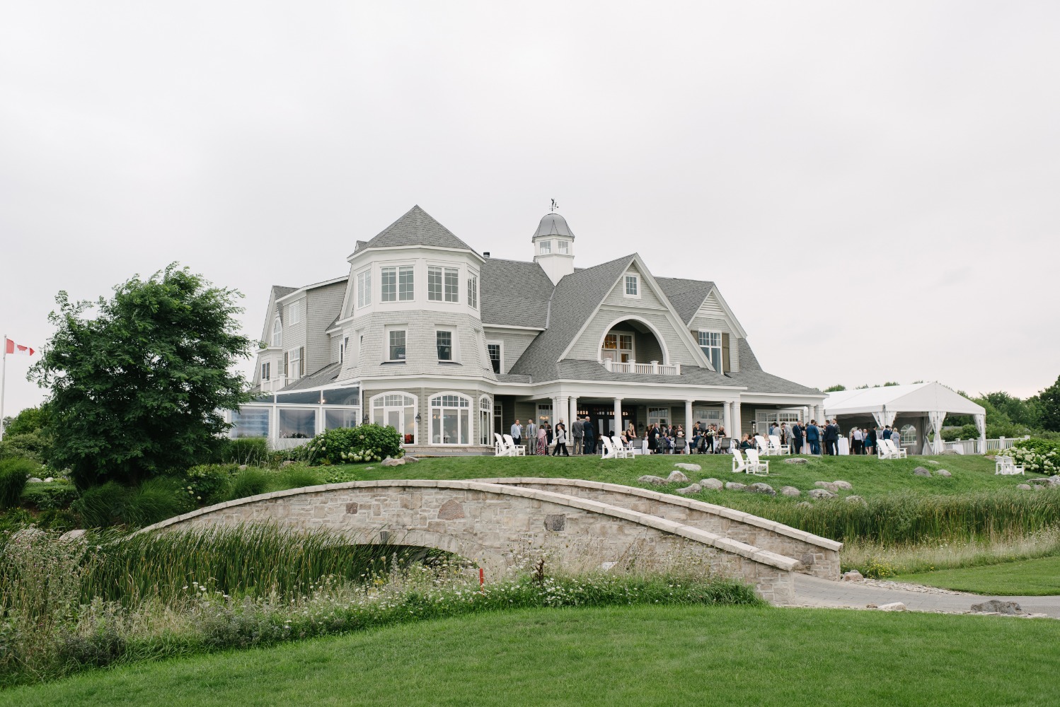
A Pink and Grey Lighthouse Wedding at Cobble Beach
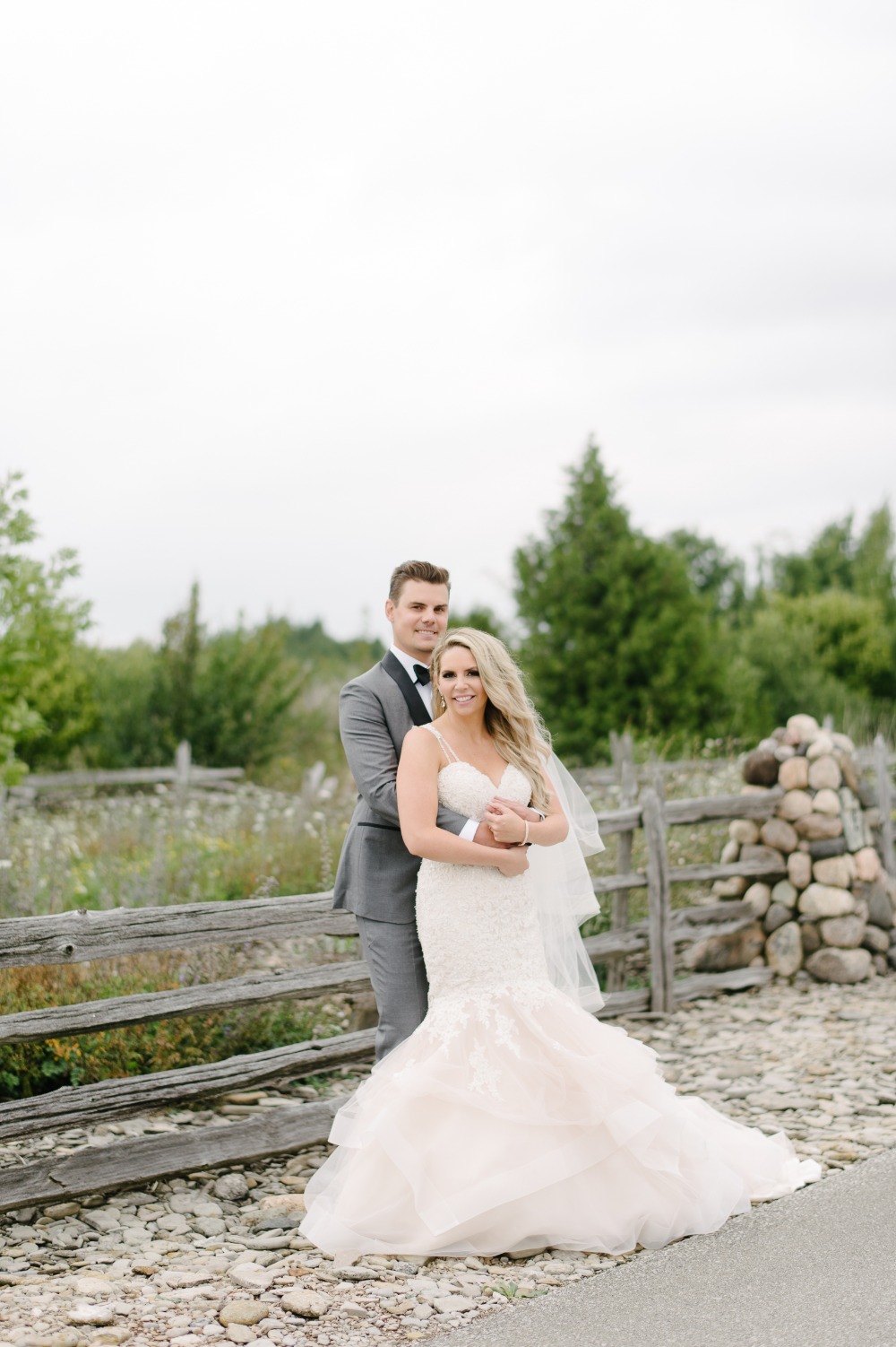
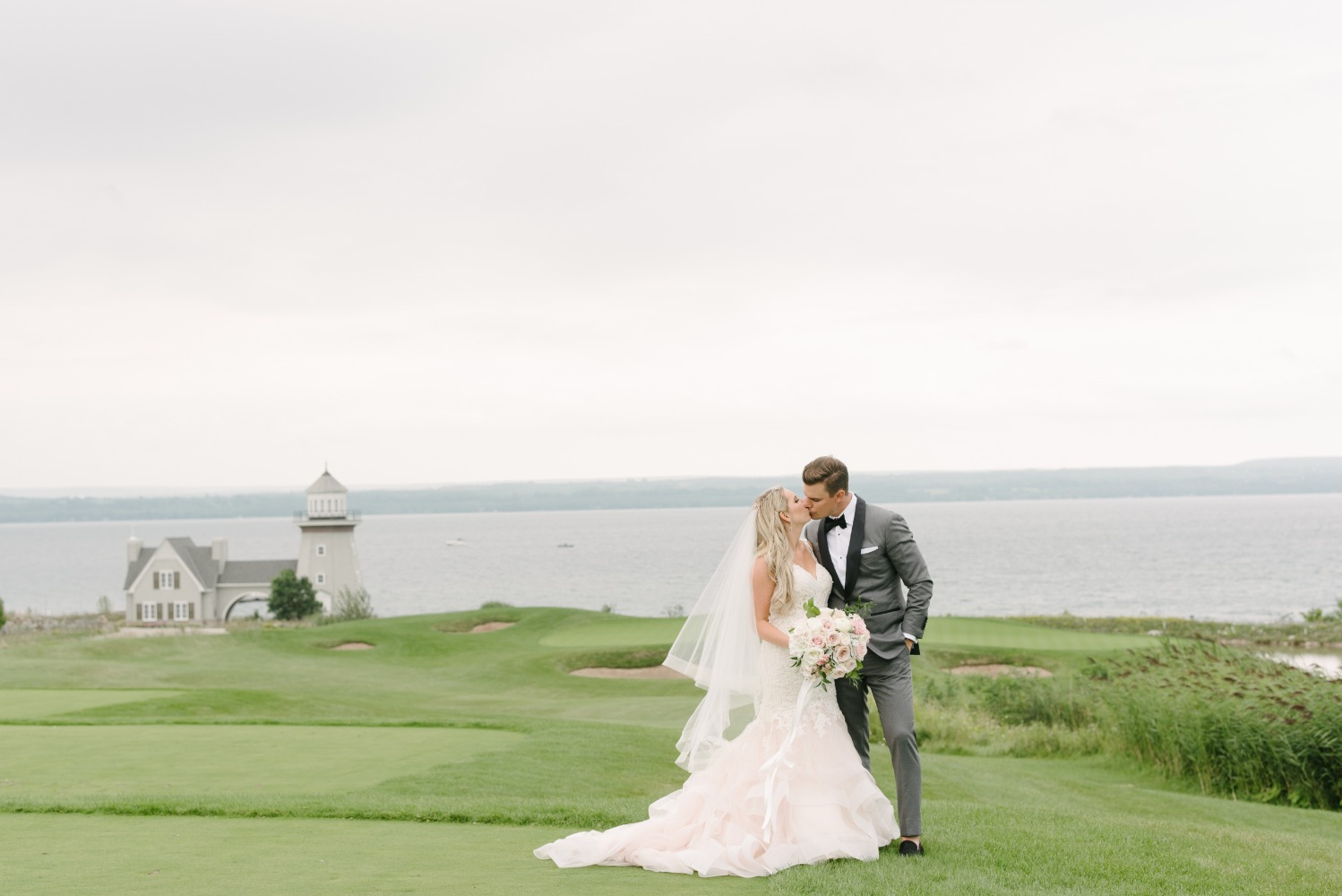
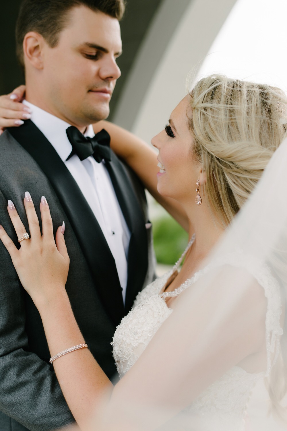
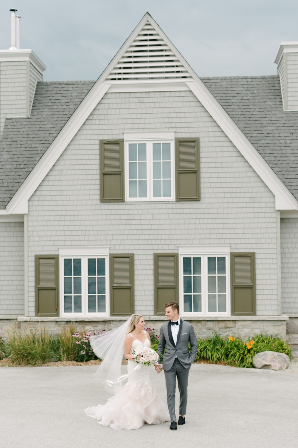
Planning a wedding is a lot of work, but this planning savvy bride took it upon herself to design her big day from start to finish. Her obsession with all things pink and sparkly (have you seen her bridal shower yet?!) was blended with her husbands' minimalistic taste in shades of grey for their chic and elegant wedding.
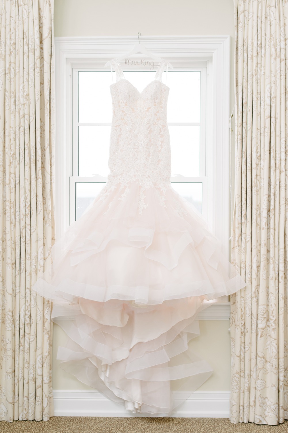
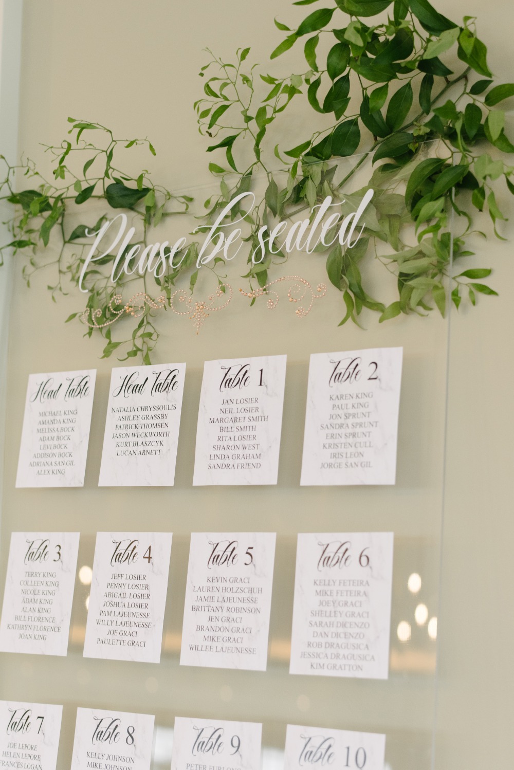
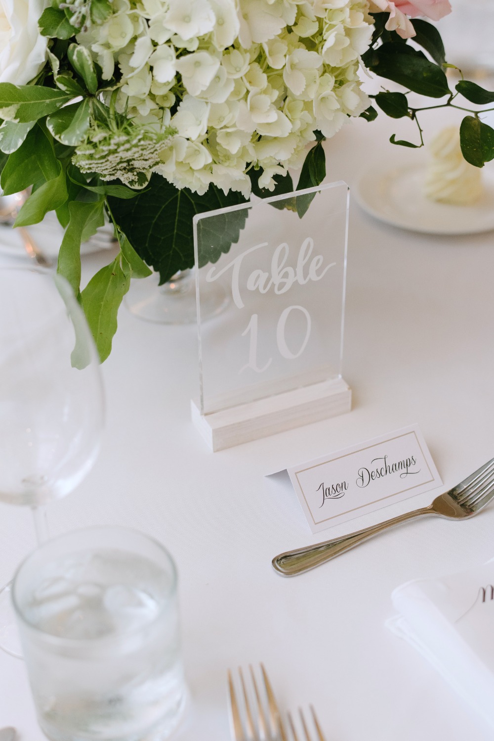
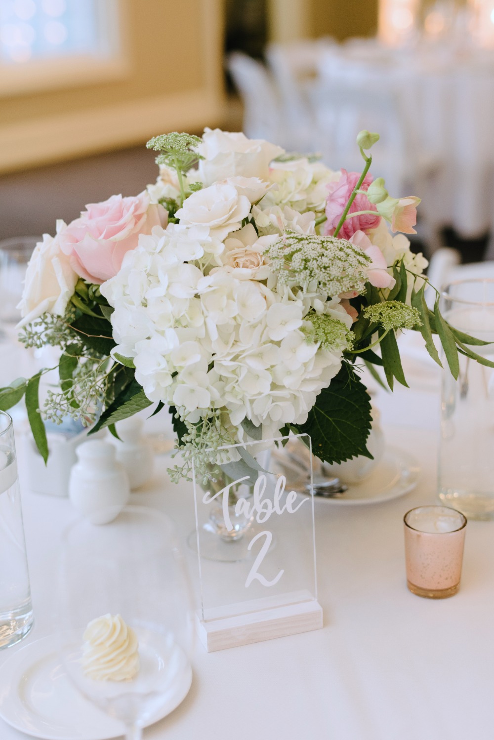
Her stunning blush wedding dress from Madeline Gardner is a total dream, but our favorite detail has to be her beautiful DIY acrylic seating chart! Because who doesn't love a good DIY? Learn how she made it below, plus grab a closer in look in the full gallery from Mango Studios.
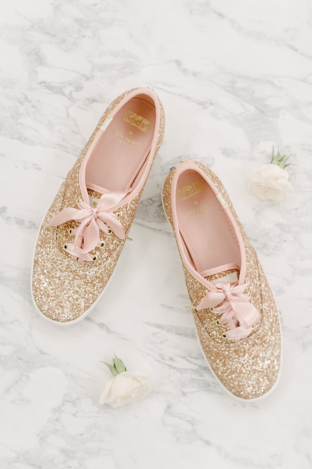

Pink, grey, and rose gold
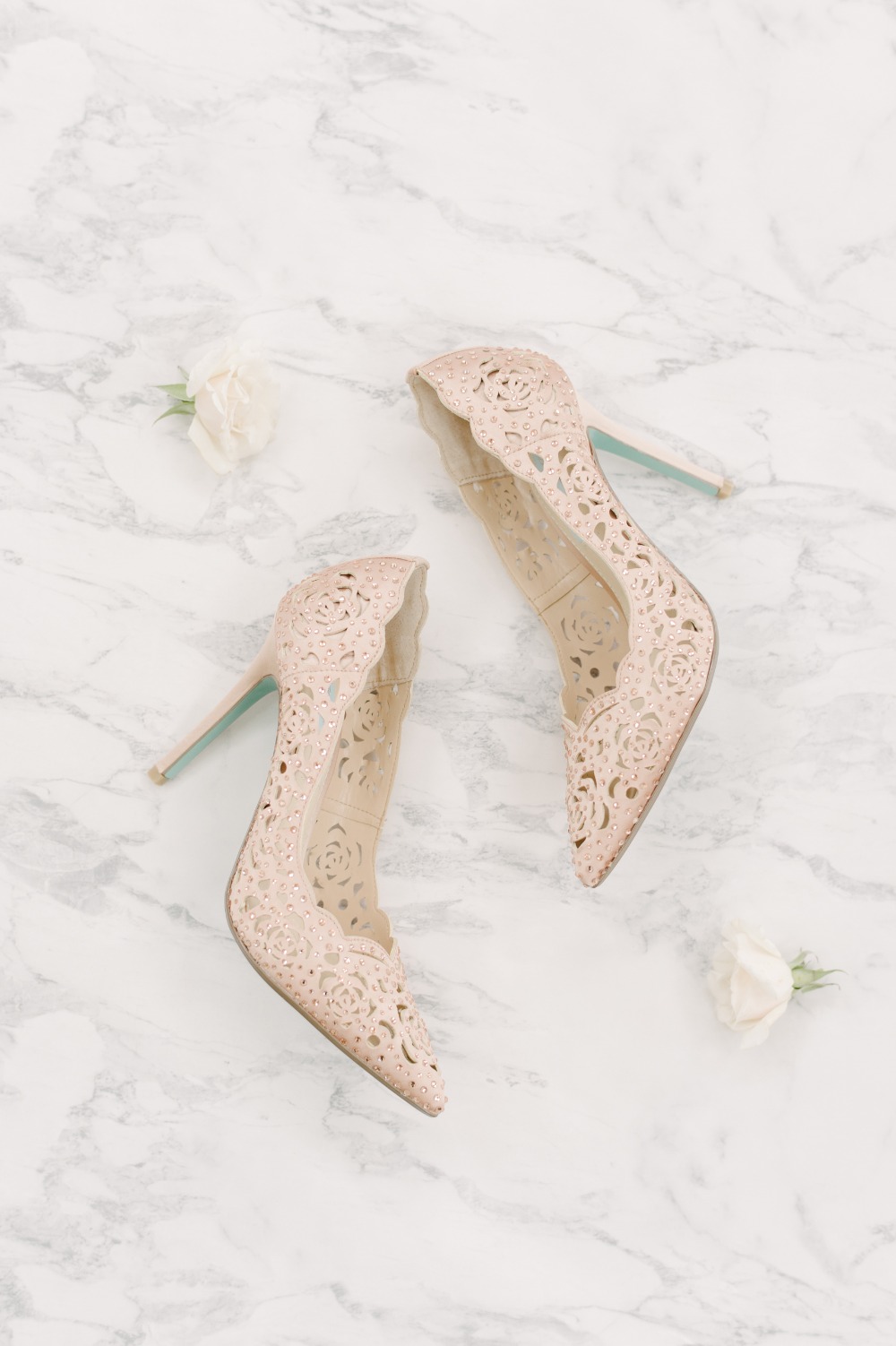
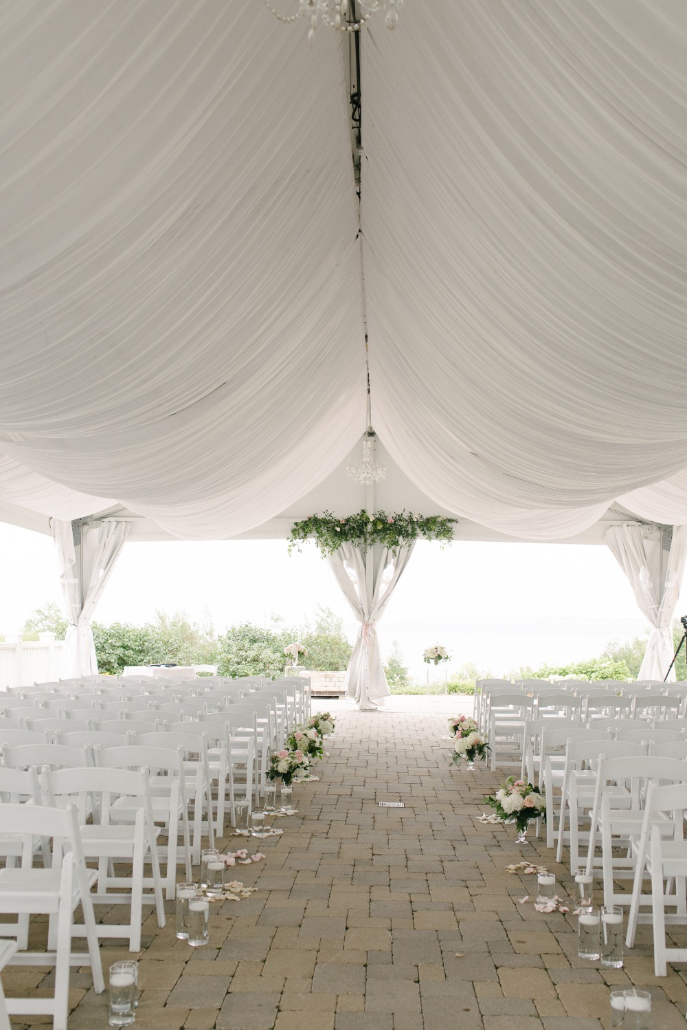
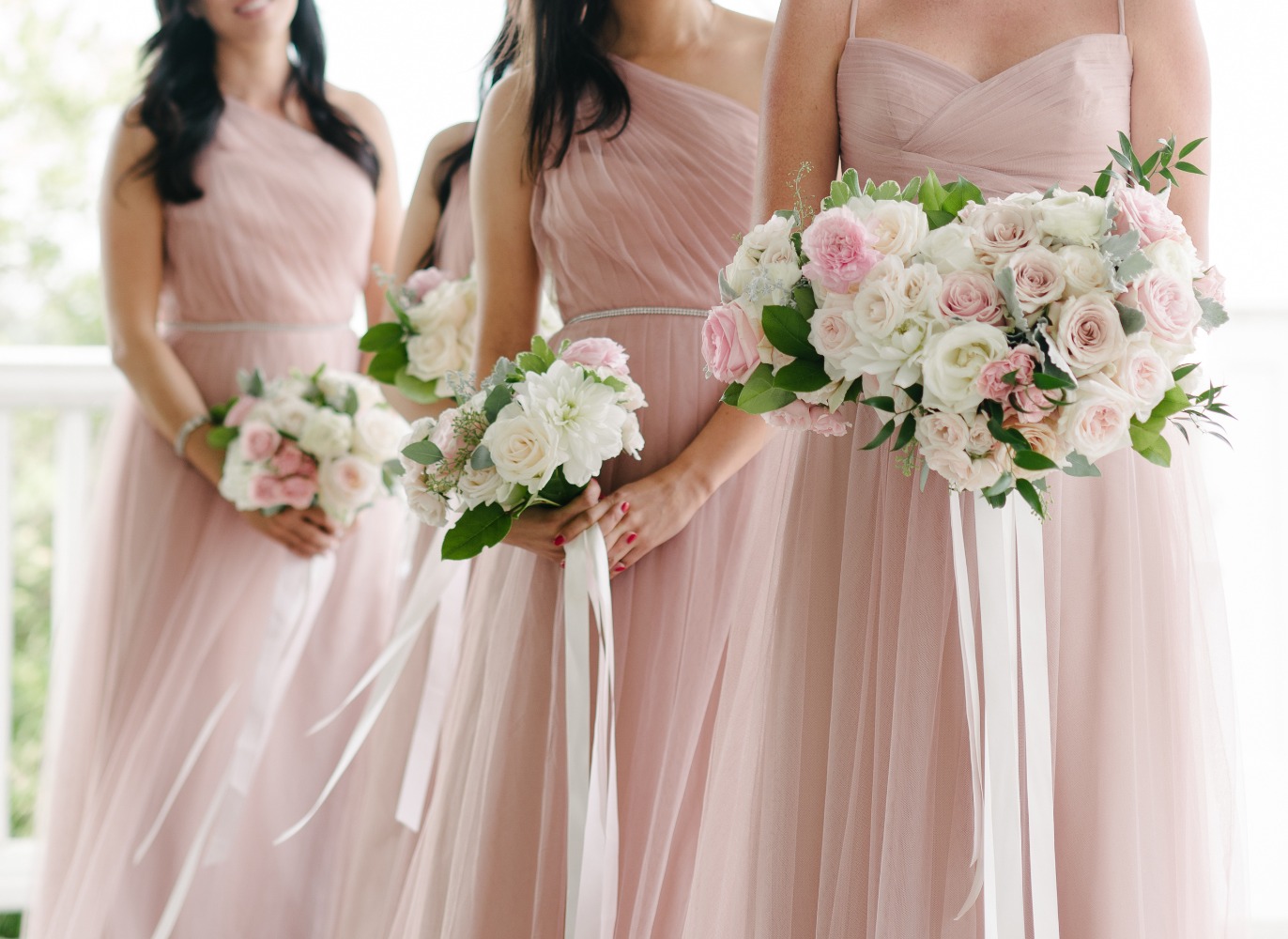
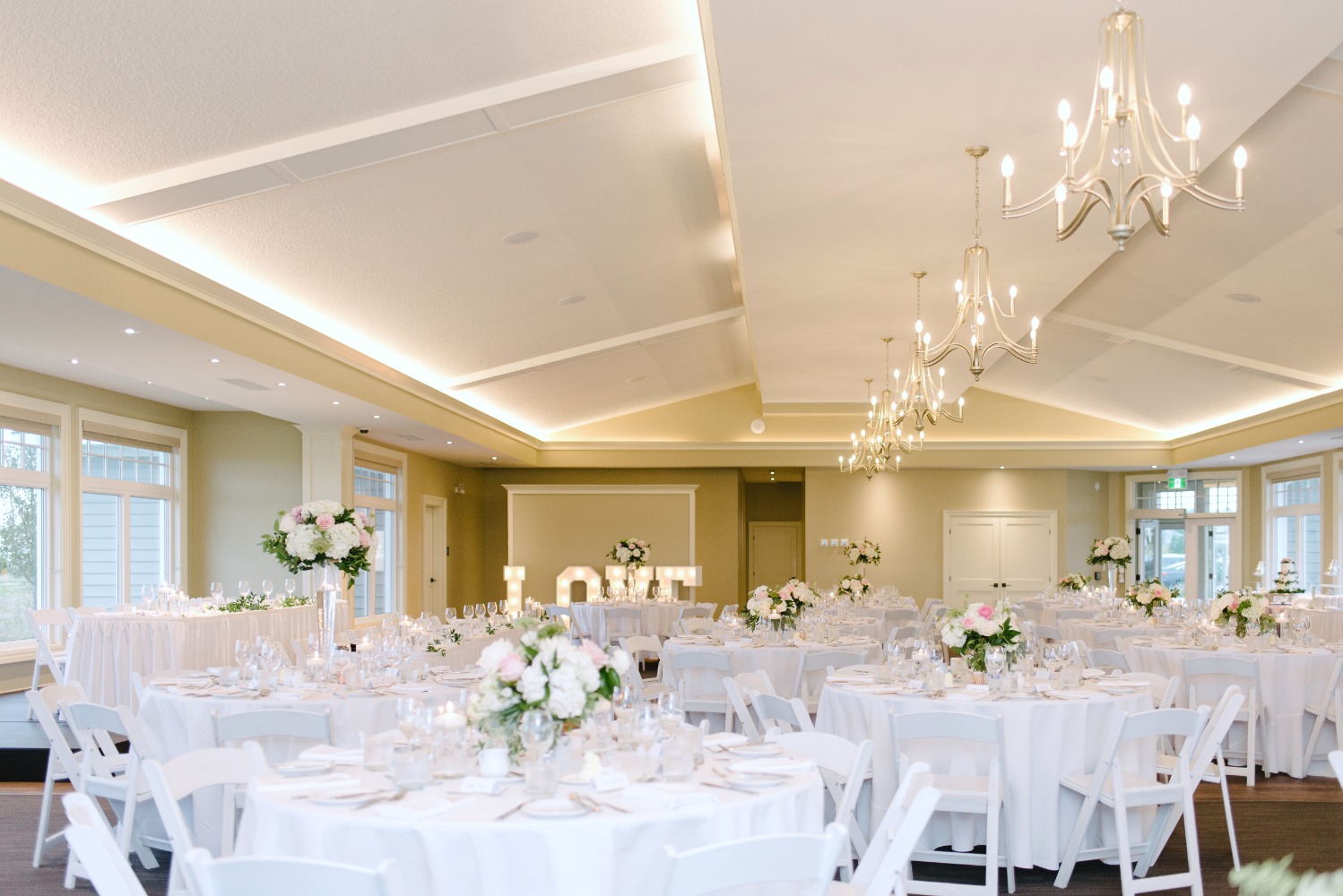
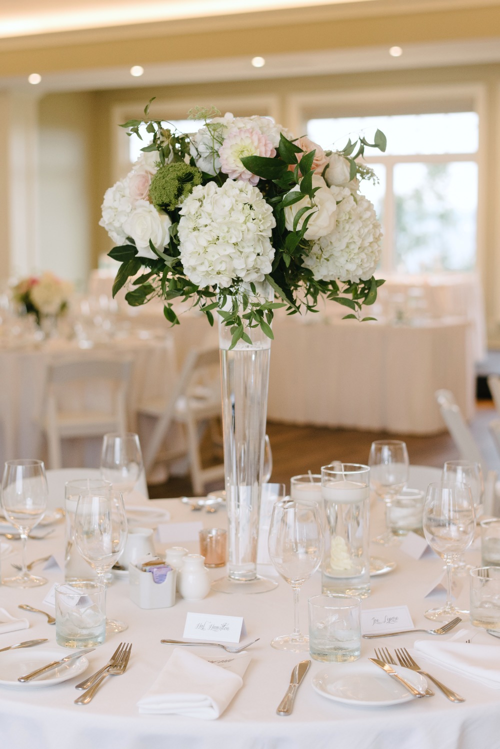
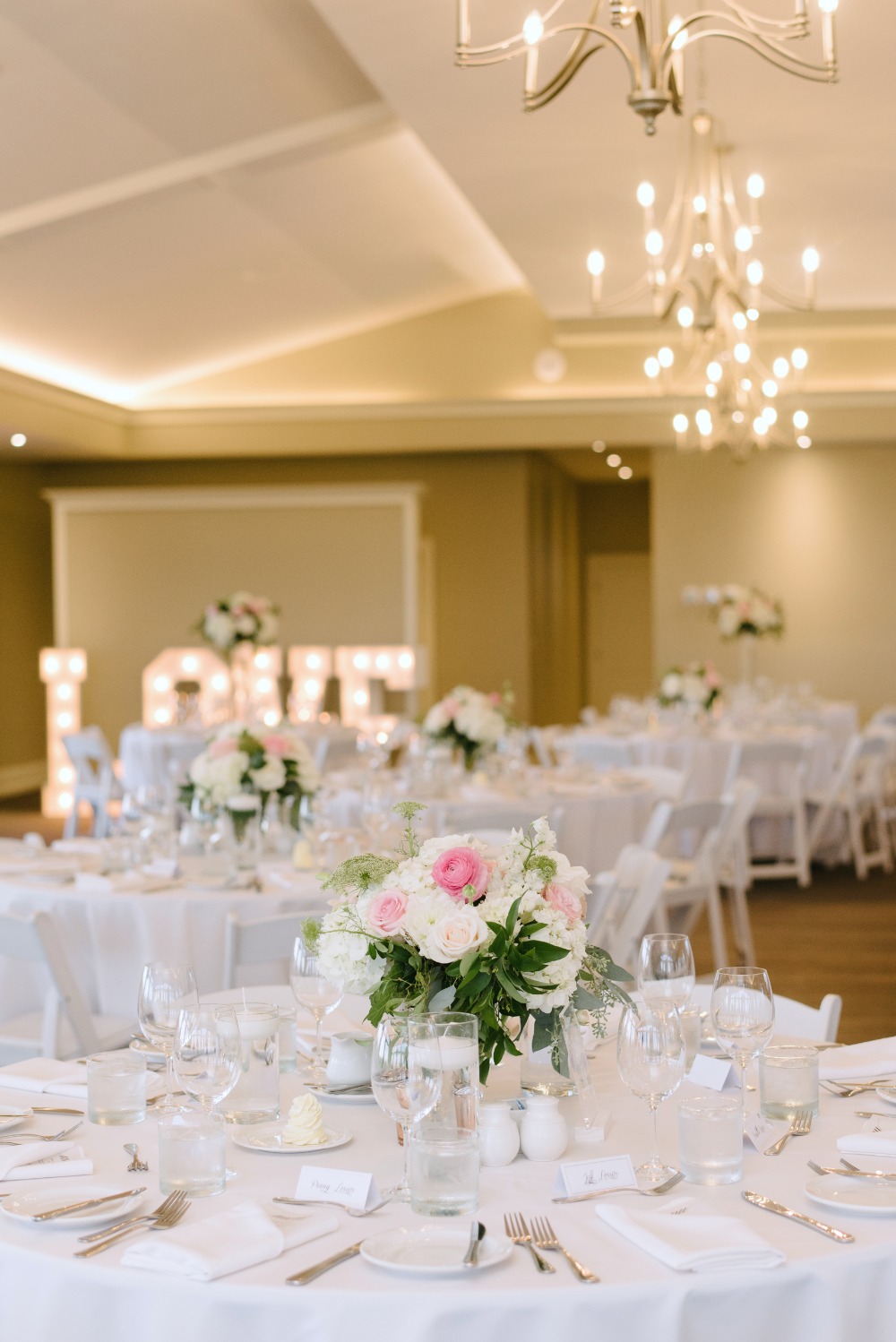
From the bride: When it came to planning our wedding, the colour scheme was a no-brainer. Pink has been my favourite colour for as long as I can remember. I knew I wanted to incorporate blush pink tones to keep things light and romantic. I also really love rose gold, so I wanted to include rose gold accents. For the men, I loved the idea of light grey because it always looks so good next to pink. I also incorporate some clear, acrylic details. I love the modern twist that the acrylic added to the overall look of the decor. I love things to feel as light and airy as possible, so I also included some white details whenever possible (linens, chairs etc.).
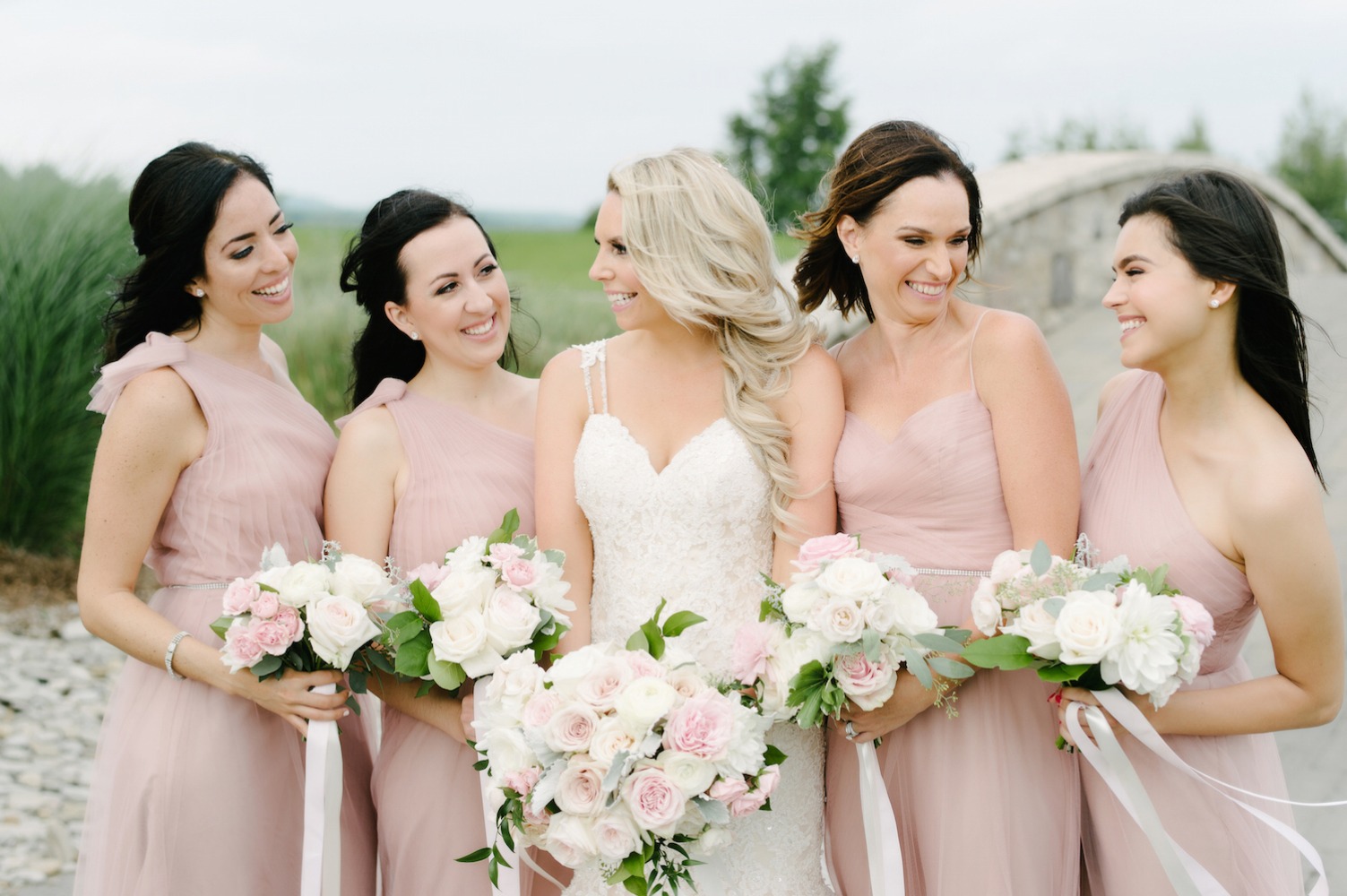
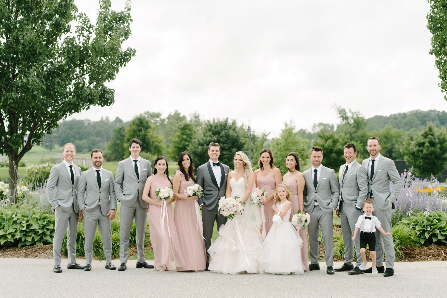
Blending both their styles
I love planning events, so I took on planning the wedding myself, without an event planner. I loved the planning process and took my time when putting together all of the special details. It was also fun to involve my husband in all of the details and work together to compromise on the overall vision. I love everything pink, sparkly, girly and a little over the top. My husband prefers things to be masculine and minimalistic. We wanted the day to reflect both of us, which took compromise on both of our parts. Looking back at the photos I think we did a really great job of meeting somewhere in the middle and we were both happy with the outcome.
DIY Acrylic seating chart
I loved adding our own special personal details to the wedding day. I ended up making the seating chart myself. I bought a piece of acrylic from Home Depot and used marble paper for the table listings. I also had a vinyl decal printed to add for the title. I asked our parents and grandparents for a photo from their wedding to frame and display at the reception. It was such a sentimental moment for when our guests walked into the reception space.
DIY supplies
Acrylic sheet - Choose your size! We recommend 1/8 in. thickness. Find them here.
Vinyl decal - Find some seating plan decals on Etsy.
Marble paper - Here's a similar marble design on Zazzle.
Double-sided tape - Find some here.
Saying "Yes" to her dress
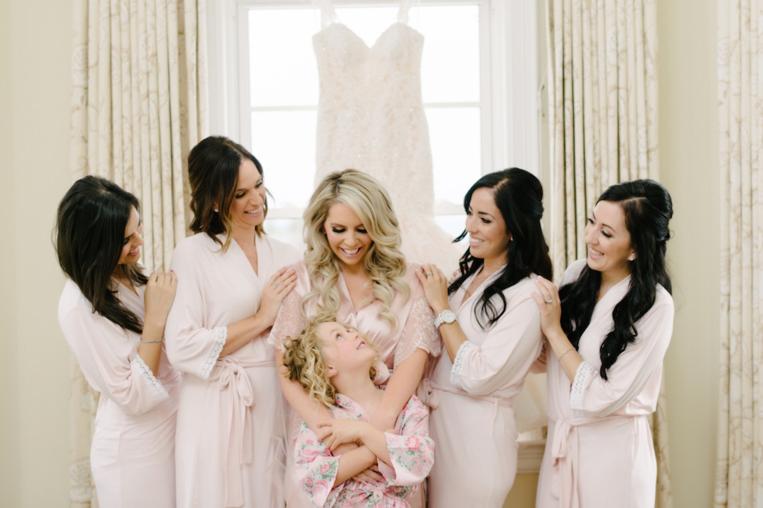
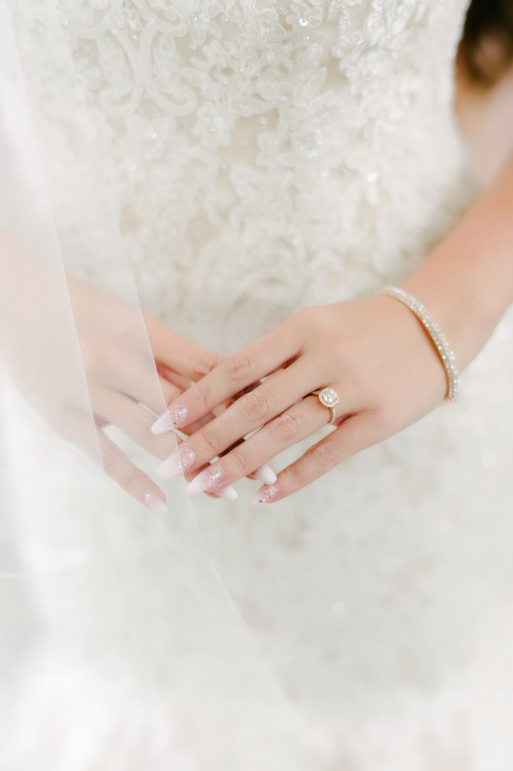
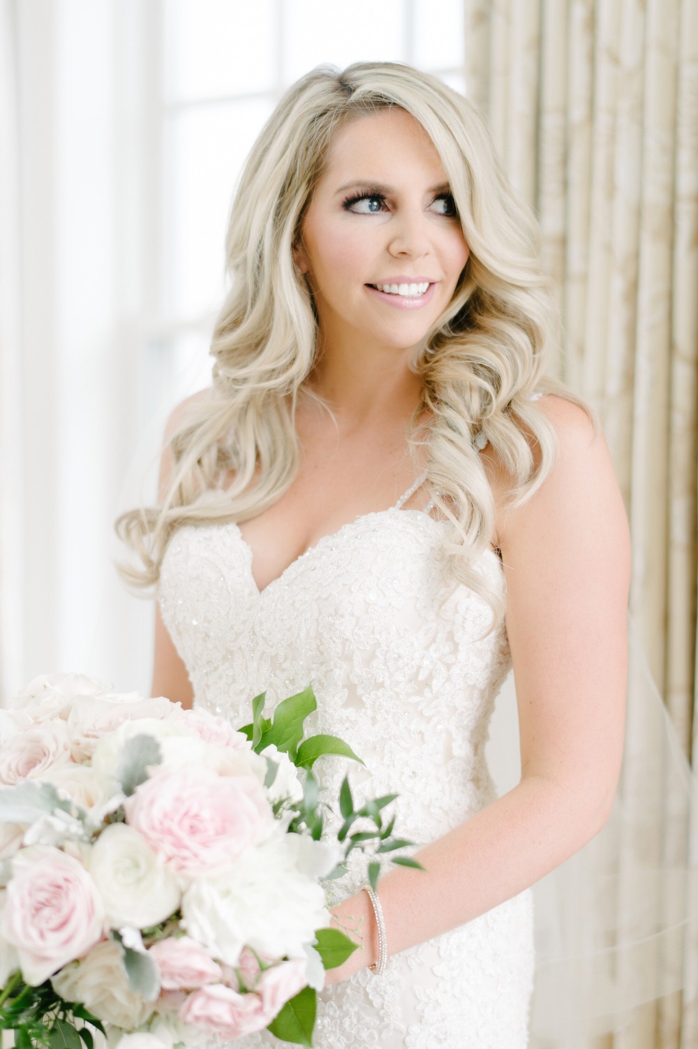
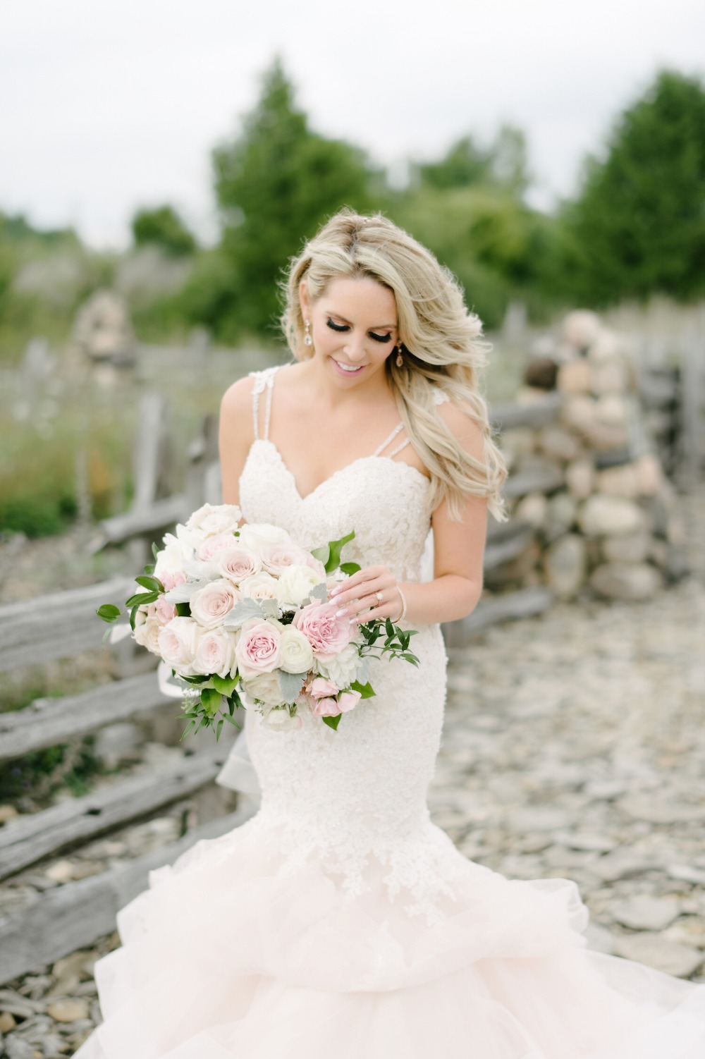
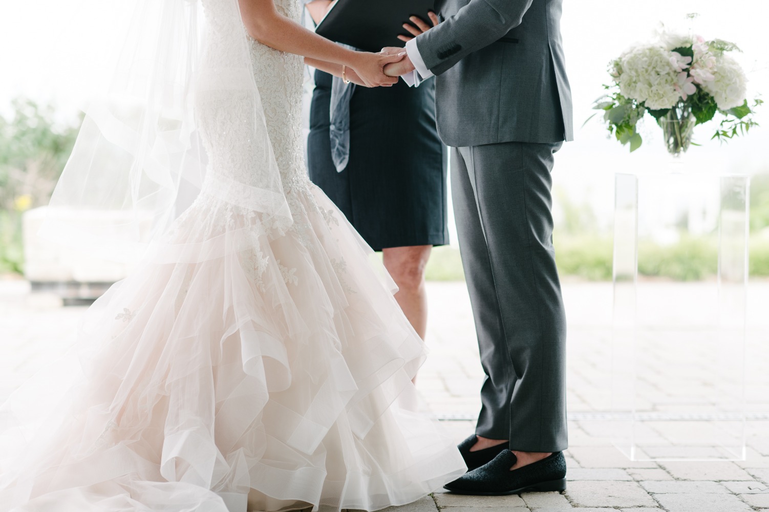
Picking out my dress was one of my favourite parts. I loved traveling around to all of the beautiful bridal boutiques with my family and friends on the hunt for the perfect pink gown. I knew I wanted some pink in the dress, but I also wanted the dress to still feel and look like a wedding gown. When I finally came across this Morilee by Madeline Gardner gown I instantly fell in love. It was the perfect mix of everything I had been looking for. It had a subtle touch of blush pink at the bottom of the gown and the top of the dress is off-white lace, so it still felt very bridal. I wasn’t expecting to have straps, but these straps totally make the gown! They are so beautiful. I didn’t want my dress to be boring, so I love that this dress was a little mix of everything (colour, lace, sparkle, tulle, beaded straps) without being too over the top. I’m still upset that I only got to wear it for one day!
- Acrylic Easel: CB2
- Bridesmaid Dresses: Monique Lhuillier at Pearl Bridal House
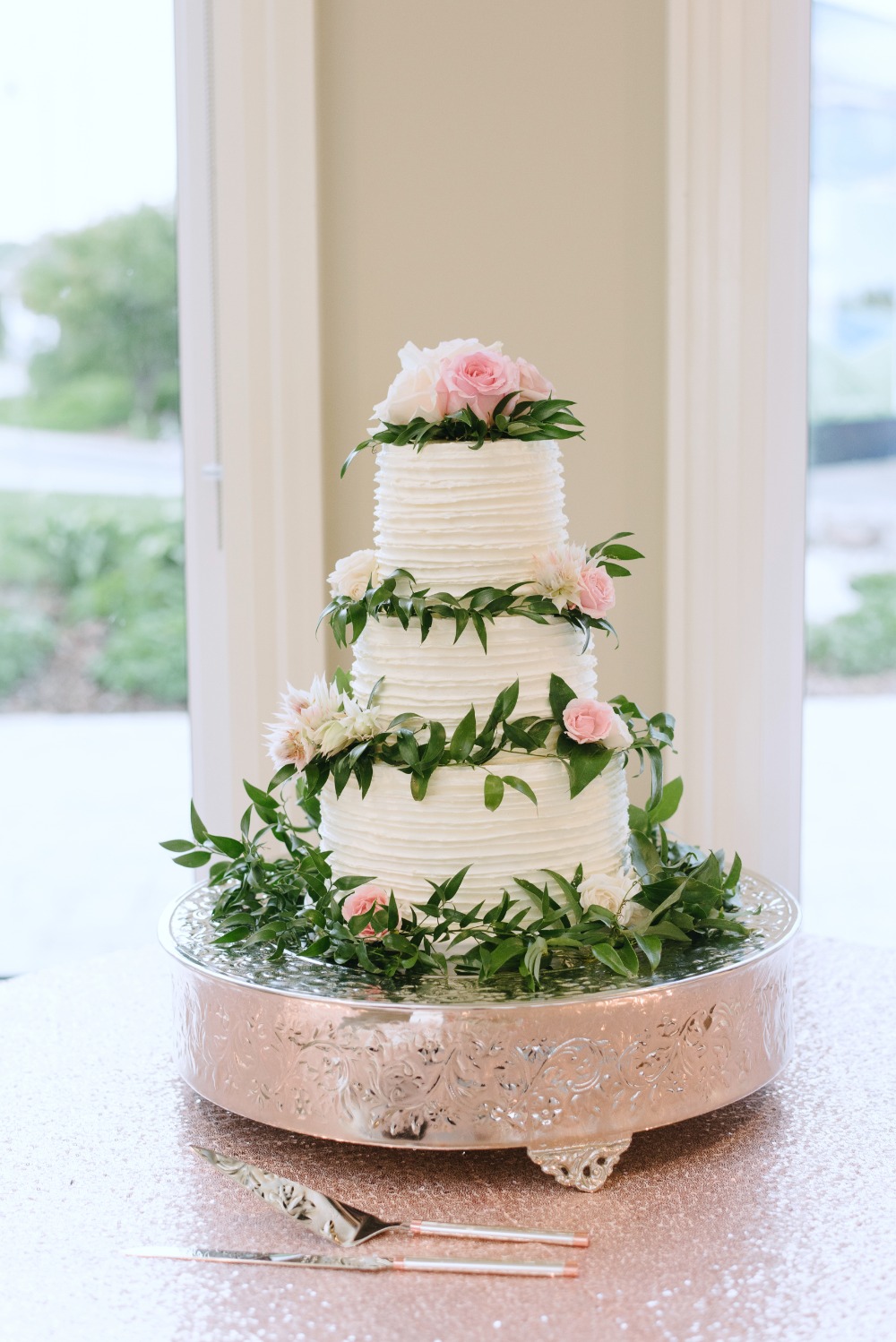
- Cakes & Catering: Sweet as Cake Custom Designs
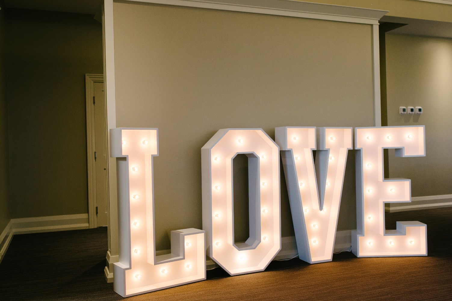
- Favors & Gifts: L.O.V.E. Light Up Letters by Benchmark Designs
- Flowers: Flower Maiden
- Groom & His Men: Suit Supply
- Hair, Makeup & Beauty: Cocclola
- Jewelry: Custom Rings by Studio 1098
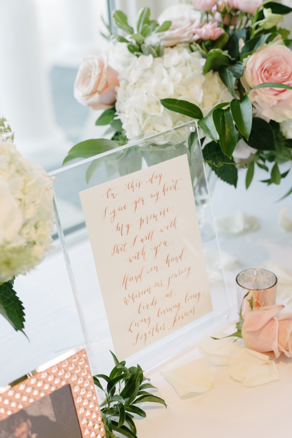
- Paper Goods & Calligraphy: Cecile Lau Calligraphy
- Photographers: Mango Studios
- Pink the Town: Amanda King
- Rentals: Vintage Bash
- Venues: Cobble Beach
- Wedding Dresses: Morilee by Madeline Gardner at Amanda Lina's
- Wedding Films: Juno Pictures
